The ten principles of guitar design, Part 6, Honest
This is Part 6 of a 10 part series, applying Dieter Rams’ “10 Principles” to guitar design. Just as we did in previous installments, we should understand that these principles were just one designer’s opinion as to how to evaluate their work, and that they’re presented in their original order assuming that there is no particular importance to that order.
Principle #6:
Good design is honest
It does not make a product more innovative, powerful or valuable than it really is. It does not attempt to manipulate the consumer with promises that cannot be kept.
It is what it is, and it’s not what it’s not. What you see, feel, and hear is what you get. The design is not intended to deceive or be misleading, and it hasn’t been dressed up or hiding anything.
This, like Principle #5 (“Unobtrusive”), is quite often kicked to the curb with gusto and extreme prejudice by guitar designers. Gimmickry is as old as lutherie itself, with countless design Concepts based on pseudo-innovation. It’s almost as bad as golf equipment in that regard. Guitars that seemingly ooze superhuman powers can be found in most big box music stores. Just as Detroit automakers sold consumers on as much chrome plating as possible, guitar manufacturers attempt to impart value with gold plating, inlay, and paint.
What is “Honest”?
Any dictionary will serve up a veritable litany of virtues, platitudes, and value judgements under the definition of “honesty”. An honest person is not deceiving, is truthful, virtuous, deserving, well-intentioned, unpretentious, and so on. Obviously, it’s very easy to fall short of such a lofty ideal, so perhaps we should consider a designer’s honesty in degrees rather than simply honest or dishonest.
I think what Mr. Rams’ is getting at in this Principle is simply a reconciliation of the product’s true nature against its image. A can opener should give us the impression that it’s designed to open cans and not stream audio or function as a floor jack to lift the van in the driveway. A good guitar design, then, would be one that delivers exactly what it suggests without implying that it’s anything more than what it appears.
Plagiarism and Counterfeits
We can expand on Mr. Ram’s Principle a bit to include borrowing of design elements and also outright intellectual property theft. You could certainly argue that plagiarism and counterfeits are manipulative and therefore dishonest, implying that the forgery has the same innovation, power, and value as the original.
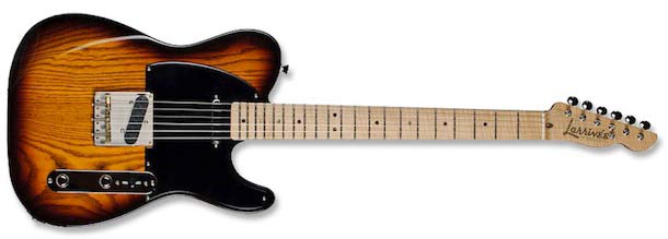
Plagiarism of design elements is very common amongst guitar designs. The very fact that I can refer to a design as an “S-Style”, “T-Style”, and “LP-Style” and have it’s meaning understood by another guitarist is testimony to that. As guitarists and guitar-buying people, we’ve come to expect it, and in some ways the marketplace encourages this. Does it mean that the example below is a bad design? Certainly not – it looks like a great guitar, but clearly it doesn’t score high when evaluated on this Principle alone.
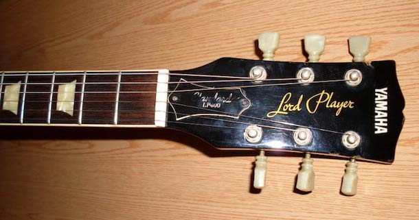
What if we push the envelope just a little bit further where we not only borrow some of the design elements but actually mimic both the elements and their juxtaposition? In other words, what if we do everything possible to capture the look and feel of an existing design in our own work? Take for example the Yamaha below. Everything from the peghead shape, the tuners, the inlays in the fingerboard, to the script logo was designed to mimic a Les Paul. It’s not even subtle. It’s no wonder that these (and other examples from other manufacturers) are labeled as “Lawsuit” guitars.
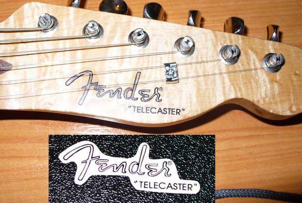
Some push the envelope even further still, to the point where it’s no longer an exercise in design but one of counterfeiting. Even this is tolerated to some degree, as evidenced by the availability of waterslide decal copies of standard brands and models. I’m sure this completely conflicts with the Honesty Principle, but I don’t think that anybody really considers this kind of work to be design.
Skeoumorphism
Any contemporary discussion of Industrial Design will eventually get around to the Apple products. The hardware is functional, unobtrusive, innovative, and incredibly popular. However, there is some consternation amongst some designers regarding the software as it sometimes includes visual elements that mimic real-life counterparts. Examples would include the stitching in a virtual desktop calendar, the torn paper remnants at the top of a virtual notepad, or the fake knobs and sliders in an audio editing application. Some designers object to this mimicry as a direct attempt to manipulate the user and alter their perception of the application’s interface, using visual cues that were necessary in the physical object but aren’t necessary to the operation of the virtual one.

This is referred to as “Skeoumorphism”, derived from the Greek words for “vessel, container, tool, implement” and “shape, form”. The idea is that mimicking some of the familiar elements of original products in their derivative or virtual products increases their adoption, use, value, and acceptance. They help bridge between the traditional and the modern. Examples such as automobile wheels with spokes, fake woodgrain/leather/stitching, shutter sound on digital cameras, text in movies with teletype sounds. In guitar design, the classic example is the painted-on F-holes which serve no other purpose than a simple visual aesthetic, but were employed to increase the guitar’s acceptance among players.
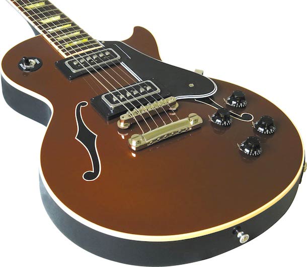
You’ll occasionally see other variants on this idea, such as fake snakeskin, leather, metal plate, rivets, and other design elements being integrated into the guitar visuals. You can expect to see more skeoumorphism in guitar designs as they incorporate software modeling or completely new instrument Concepts. Some designers will want to bridge the gap between physical elements such as control knobs and their virtual counterparts displayed on screens integrated onboard the instruments.
Manipulation and Value
We can all think of examples about guitar models that are essentially cosmetic variations of the same basic design in terms of functionality. This is the “Good/Better/Best” approach, starting with a basic “no frills” design, then adding things like fingerboard binding, gold hardware, progressively fancier inlay, etc. To be fair, some product lines that fall into this category will build in enhanced functionality, whether it’s in terms of more capable hardware, more durable components, better quality electronics, and so on.
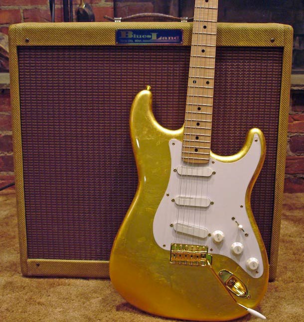
Then there are the examples where the aesthetic design choices are made simply to enhance the perceived value of the guitar. One of the more common methods is to select woods that feature flame or quilt figuring, which certainly does have a visual appeal to many but has debatable value when it comes to improving musical tone production. Finishes and other decorative touches are also used, including the notable example of gold leaf applied to an otherwise ordinary Stratocaster body. To what degree would we consider this to be manipulative or implying value that isn’t really there? Or is this simply an appeal to individuality or relative scarcity?
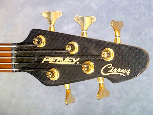
Another element commonly used is the application of decorative veneers on top of other materials. This may be done to save money in materials costs or make production easier. The implication, though, is that the material is something that it really isn’t, but just appears that way. In the example below, the carbon fibre veneer is used only for cosmetic effect, not structural. You could argue that this is manipulative, dishonest, or otherwise misleading.
