The ten principles of guitar design, Part 3, Aesthetics
This is Part 3 of a 10 part series, applying Dieter Rams’ “10 Principles” to guitar design. Just as we did in previous installments, we should understand that these principles were just one designer’s opinion as to how to evaluate their work, and that they’re presented in their original order assuming that there is no particular importance to that order.
Principle #3: Good design is aesthetic
“The aesthetic quality of a product is integral to its usefulness because products we use every day affect our person and our well-being. But only well-executed objects can be beautiful.”
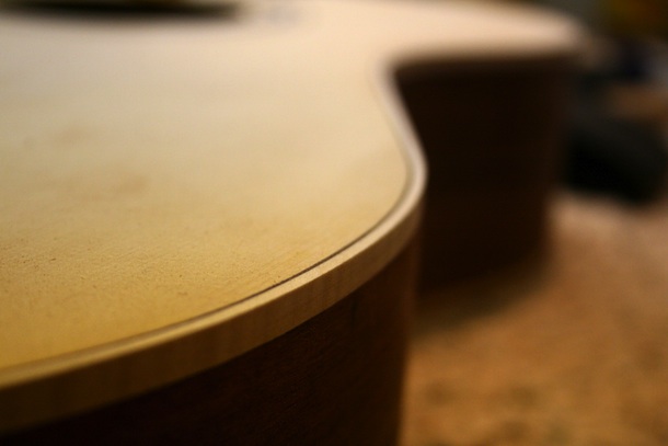
Definition of “Aesthetic”
I’ve called again upon my computer’s dictionary to give us the definition of the word “aesthetic” as a starting point, and I’ve also pinged a few other dictionaries available on the internet for assistance. There are some interesting variations among the definitions I’ve found, but for this article let’s just use the ones that come up on my computer.
The first two are adjectives, so therefore are descriptive of something. In this case, that something is going to be a guitar, and we can start out with “concerned with beauty or the appreciation of beauty: the pictures give great aesthetic pleasure.” It describes the emotional response that the object evokes; not just any kind of pleasure, but aesthetic pleasure.
The second is “giving or designed to give pleasure through beauty: of pleasing appearance.” This definition is much more useful, and it explicitly suggests that we have some control over it through our design work. The key word in both definitions is “beauty”, and our evaluation of the guitar is going to be based on the evaluator’s sense of beauty and how pleasing the guitar is to them. I’d extend the definition to include the other senses besides sight, especially feel.
Aesthetics and Image
The purpose of the 10 Principles is to provide some guidelines for the designer to evaluate the quality of their own work. We could take the easy way out and limit the conversation to simply what the guitar’s designer feels is beautiful or not beautiful. That’s fine to some extent for somebody that’s designing and building a guitar solely for their own use, but still they’re probably concerned at least a little bit about how others will perceive their work. For a commissioned or production guitar, we’d want to have a better idea about what the guitar consuming player perceives as beautiful.
The third definition describes aesthetic as a noun, a thing – “a set of principles underlying and guiding the work of a particular artist or artistic movement: the Cubist aesthetic.” We touched on this a bit in the previous article (Usefulness) when we described the need for a guitar’s image to match the intended use. For a classical guitarist, we’d probably emphasize some traditional design elements such as a slotted headstock, marquetry rosette, symmetrical body shape, and so on. In any case we’re evaluating the visual design elements and their influence over the emotional bond the user associates with the guitar.
I’d suggest that a great guitarist could use any properly setup guitar and do great work with it regardless of it’s physical appearance. You could hand any guitar to Keith Richards and he’d sound like Keith Richards, but would he want others to visually associate him with that guitar? Is it compatible with the image that he’d like to project? Would he be comfortable with using one guitar in a particular application or setting but another in a different one, even though he could conceivably use one guitar with the appropriate functionality for either? If he had 80 guitars hanging on his wall (which is quite possible…), which one would he leave on the stand so that he could play it every day?
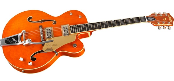
Integration of Beauty and Utility
Didn’t we cover this in the last article? In a way, we did. This almost looks like a restatement of “Usefulness” in that the way a guitar looks has a direct effect on it’s utility. So why are these two different Principles?
The Usefulness Principle emphasizes the functional aspects of the design, e.g. is it playable as a guitar, is it equipped properly for the intended use, etc. If it doesn’t meet the standards of utility for the intended use, then we don’t care what it looks like unless we want to use it as a piece of artistic sculpture. If it meets the basic requirements of functionality for an intended purpose, then we can go on to evaluate the appearance of design elements as a secondary set of criteria. So, in that limited sense, the Aesthetic Principle is part of the Usefulness Principle.
I think what we’re getting at here is a more personal view of beauty and less one of public image. Like Mr. Rams, we’re designing consumer products that buyers use every day, whether it’s for performance, practice, composition, or as props. We gravitate towards things that we deem beautiful, that are literally attractive. Given a choice between things that have identical functionality, we usually pick the one we thing is the best looking to us. Over time, we may change our perception of the guitar’s beauty and gravitate towards another one. We can also pick out details that we hadn’t noticed before or find defects that were always there as well as ones we’ve created, and in many cases appreciate them as beauty marks.
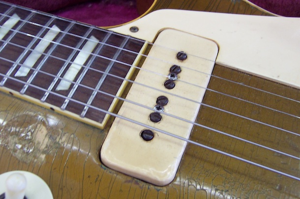
It’s more than just “form follows function”. Utility and functionality definitely needs to be a primary consideration, but why not make it attractive instead of plain? Have you designed something to be as beautiful as you possibly could given the constraints imposed?
What Makes a Guitar Design Beautiful?
The short answer is “because I said so.” It’s a subjective judgment with no universal answer, and you’d be comfortable with others associating the object with you. As a designer, you’d be proud to display it in your portfolio or use it as your online avatar. If others found it to be ugly or plain, you’d find no reason to defend it’s beauty. It simply is.
That’s great, but it’s of limited value to a designer. How do you achieve the same kind of results in subsequent design efforts? Could a hundred monkeys equipped with NURBS modeling software duplicate Jonathan Ive’s designs in a million years? Do you just make a zillion drawings and hope that you’ll come up with something beautiful? That isn’t a very productive method. You’d need some guidelines as to what things people in general find attractive, and also an inventory of the things you personally find attractive.

Individuals have their own criteria to determine what is and what isn’t beautiful to them. They may have a concrete recognition of some criteria such as their favorite color. They may also harbor some instinctual preferences and others that they aren’t conscious of. If a person commissions you to design an instrument for their sole use, then you’d have to really get to know them to find out what their real criteria are. The usual method is to develop a dialogue with the buyer, go through some standard specifications and features, but the challenge is to get at the criteria that the buyer may not be consciously aware of. The end result doesn’t necessarily have to be something that the designer thinks is beautiful, but it must be beautiful to the buyer.
For the designer in a production environment, getting to intimately know a few thousand potential buyers isn’t practical. They could work off assumptions about what’s worked before, what their marketing department is telling them, and what salespeople think is working out in the field. Again, the end product may or may not be beautiful to the designer, but a successful one is aesthetically pleasing to buyers in the target market segment. Whether you’re designing a one-off custom instrument or a production model, you’ve got to have some idea as to what buyers find to be beautiful. Obviously it’s more satisfying if both you and your client find your work to be beautiful.
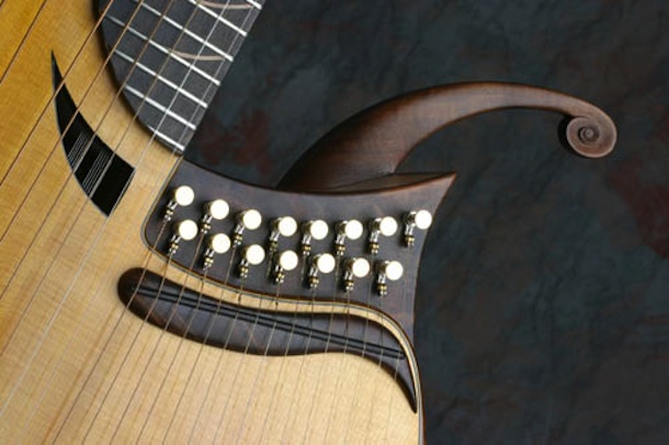
We can use concepts of elements and principles of design from other arts, leveraging the work of those that have gone before us. Each one of the elements and principles are worthy of study far beyond what we have time for here, and these are the basics that you’d expect to learn early in any arts or design education. The elements of line, color, shape, texture, space, and form are manipulated by the designer in developing their Concept, and there are plenty of resources available to help you learn how to master each of them. A very good starting point would be some of the articles posted earlier here on Guitar Design Reviews.
Bringing each of the elements together in a cohesive, purposeful design has been the traditional way to develop aesthetic objects. The designer imparts some kind of structure, organization, arrangement, or other willful process on the design – otherwise it’s simply a chaotic jumble of stuff, and humans tend to label the chaotic as ugly. Some principles commonly applied to the manipulation of elements and possible uses in guitar design are:
Unity – arranging by proximity, similarity, repetition/rhythm, theme and variation. We tend to use identical tuning machines, control knobs, inlays, and other elements, and even these should somehow relate to each other in a cohesive manner. If there’s a theme to the guitar’s Concept, then we’d want to incorporate it in the guitar’s design elements.
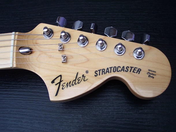
Point, Line, and Plane – basically organizing elements by their dimensional space. By their nature, stringed instruments include at least as many straight lines as there are strings, and since they’re usually near each other there should be some kind of logical relationship between them. Guitars also give us lots of opportunities to work with planes, but also we could extend this to other surfaces such as cylindrical, conical, and spherical. We can organize things in accordance with these other surfaces.
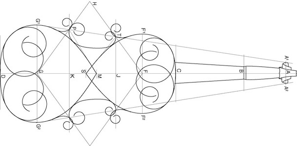
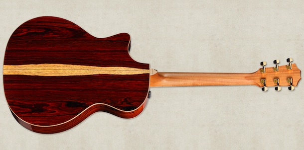
Balance – symmetry/asymmetry, radial around something, and within the work as a whole. We’re not referring to the importance of the physical balance, but the aesthetic balance of the design. One of the most common uses of symmetry in guitar design is through bookmatching of plates, including the tops, backs, and sides of the guitar body. Symmetry has another benefit in production as it’s easier, cheaper, and faster to make two identical sides for a guitar than it is to create two different ones. An example of radial balance are the numbers around the edges of a volume knob or setting indicators around a rotary control. Another example of visual balance is the location of a pickup selector switch in the upper left bout on a Gibson Les Paul while the volume and tone controls are in the lower right bout on the opposite side.
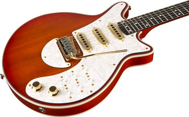
Hierarchy – logical structure in order of importance. These are typically in electric guitar controls, where the designer might logically group the controls according to the pickups they operate on. For example, I might include phase or coil cut toggles for each pickup, and I’d group them in proximity to the volume and tone for each pickup. I might locate the volume controls closer to the bridge since they get more use than the tone controls do.
Scale – sizes of elements relative to each other to draw attention to a focal point. There is some sense of proportion. Most guitars have larger lower bouts than they do upper bouts, mostly out of the stringed instrument tradition, but some feel it imparts stability. We can make an element appear more important than others by making it bigger. We also tend to like designs that are scaled appropriately to the human playing them.

Dominance – creating a focal point in the design without sacrificing Unity. A sound hole or set of soundholes are a naturally dominant feature. Graphic elements, particularly on the body or fingerboard, can also dominate but still part of a cohesive whole.
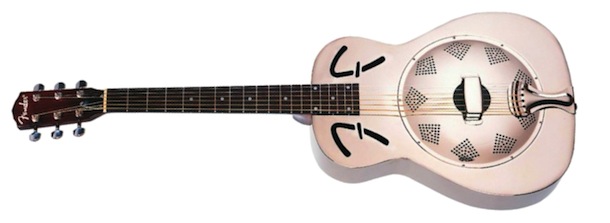
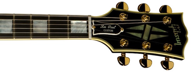
Similarity and Contrast – simplicity and standards, eliminate clutter, and create interest through contrast. These can be established standards for a maker, such as a headstock profile and layout of tuning keys. Contrast can be as simple as a white binding on a black guitar.
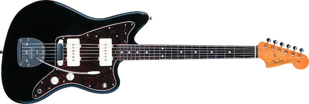
Movement – implying that the object is not static or at rest. A common way to impart motion in guitars is to create an offset between parts opposite each other across the centerline.
Of course, this is hardly an exhaustive study of what design elements make a guitar beautiful and aesthetically pleasing. There are plenty of examples of guitars that break at least one or more of the “rules” and still are regarded as beautiful.

2 thoughts on “The ten principles of guitar design, Part 3, Aesthetics”